
The “7”
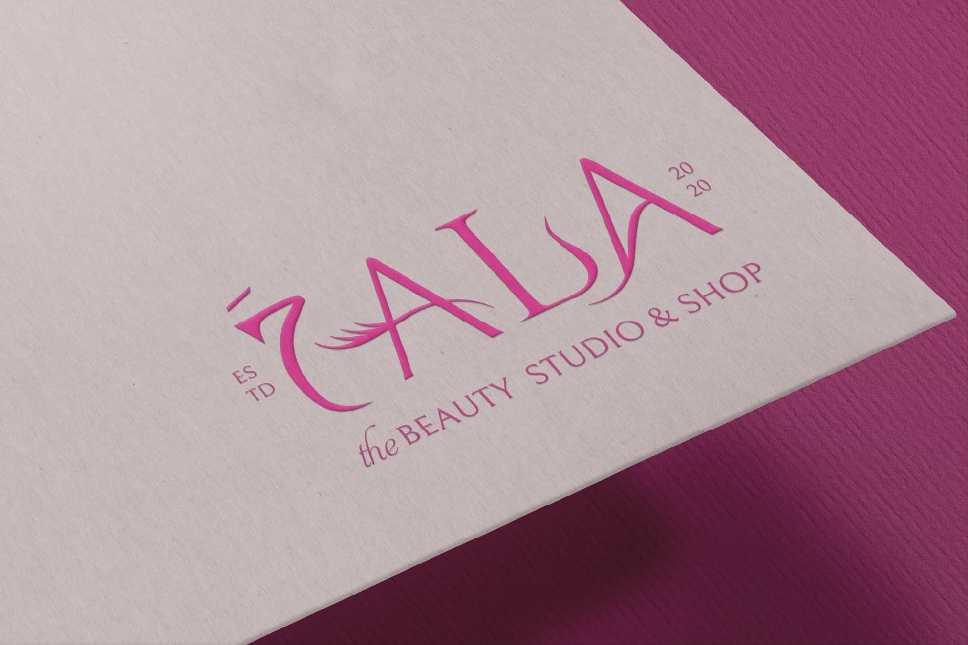
The “7” stands in for the Arabic letter “ح” — a modern Arabizi reading that bridges Arabic identity and beauty culture.
A feminine, glamorous identity for a beauty studio & shop.
Brand Identity — 2024The “7” stands for the Arabic letter “ح” — a playful nod to Arabizi, the way Arabic speakers write Arabic sounds online, while keeping Arabic identity at the heart of the brand.
The logo brings Arabic roots together with modern beauty branding — feminine, confident, and unmistakably local. A glamorous identity built for a beauty studio and shop that wants to glow different.
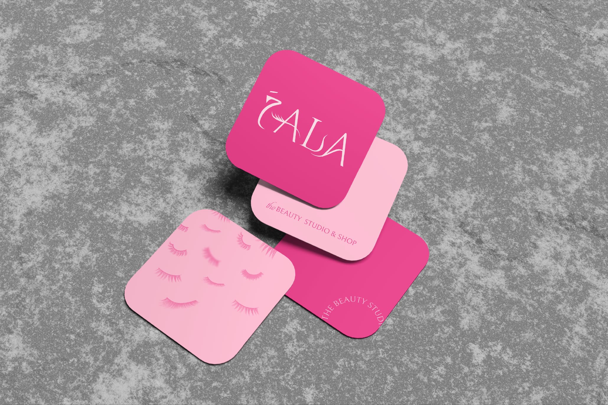
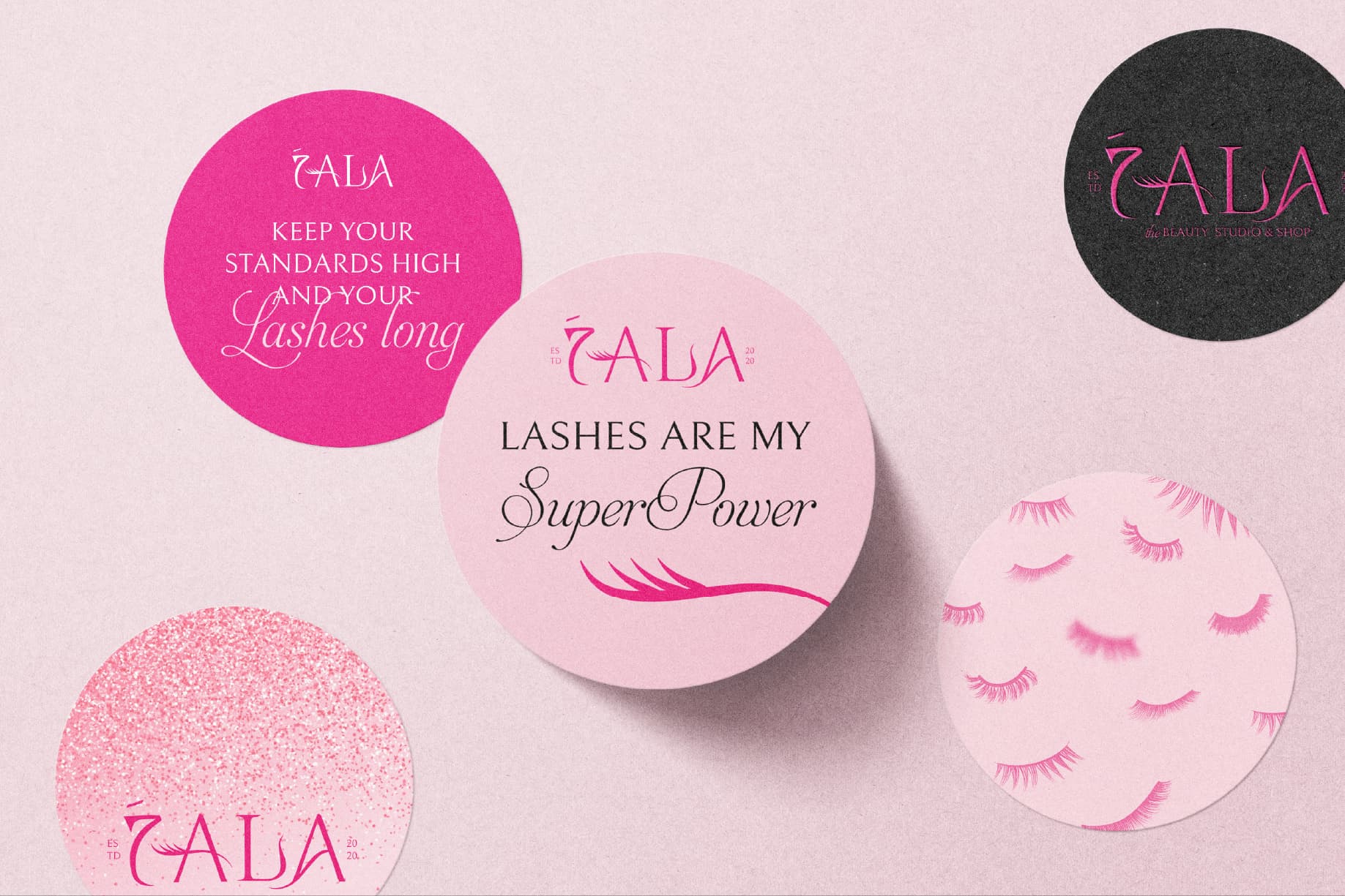
A bold, feminine wordmark where the “7” becomes the Arabic “ح” and the lash motif curls into the letterforms — a single emblem for studio, packaging, and shop.
The “7” stands in for the Arabic letter “ح” — a modern Arabizi reading that bridges Arabic identity and beauty culture.

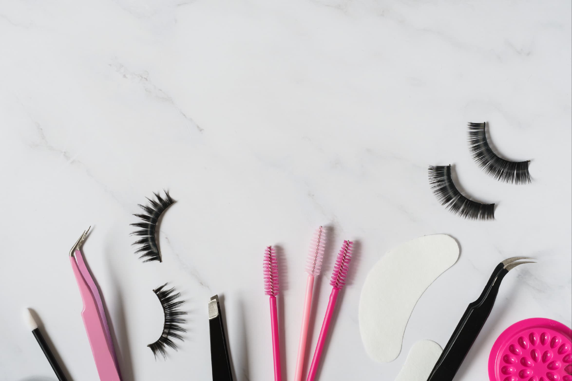
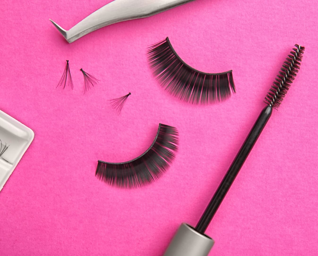
A custom lash-inspired graphic, used as a signature device throughout the identity.
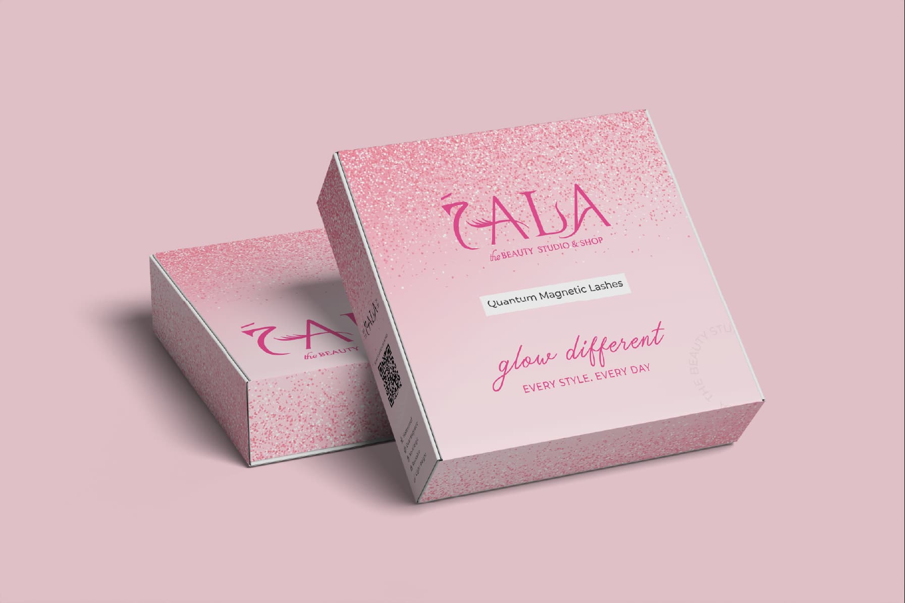
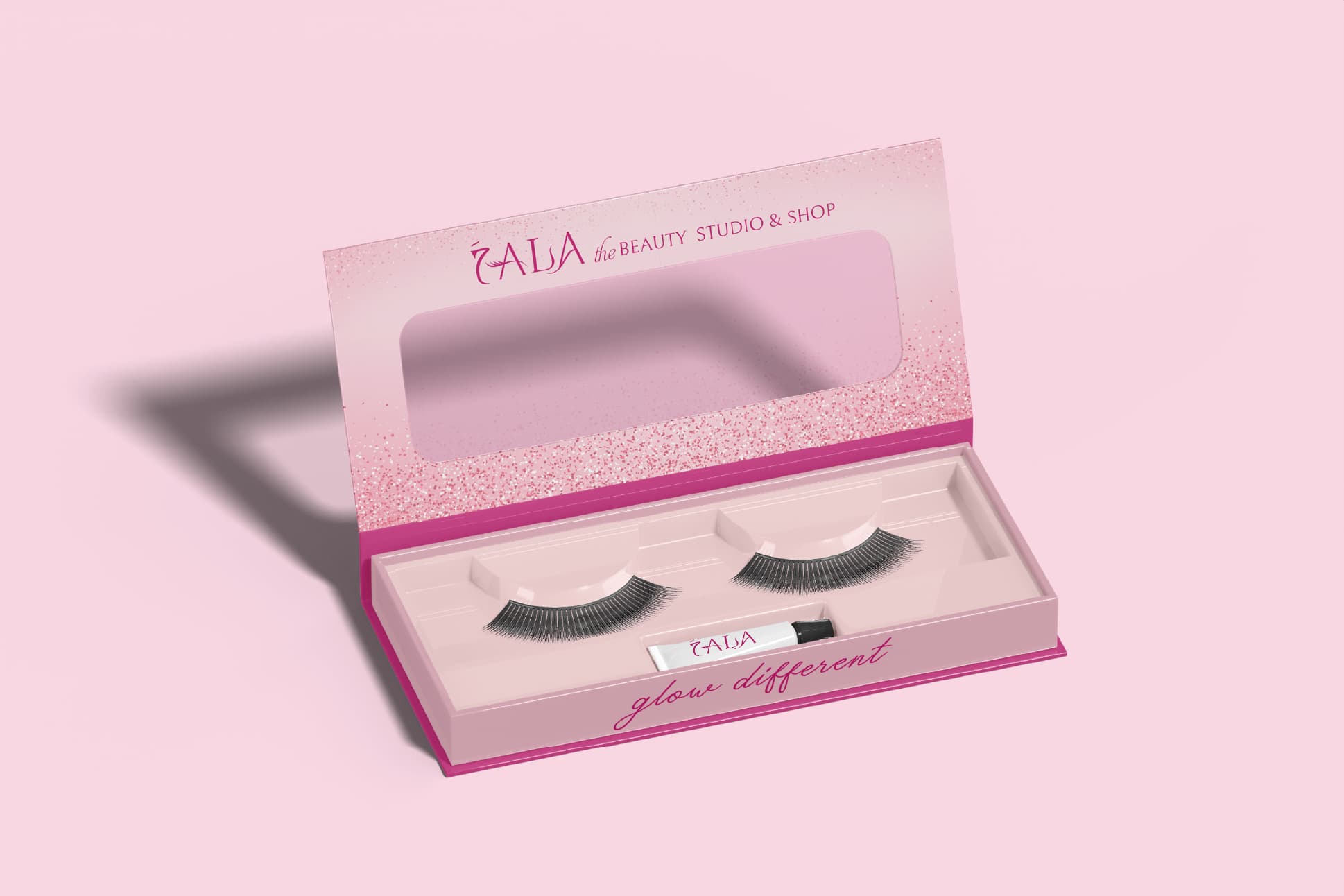
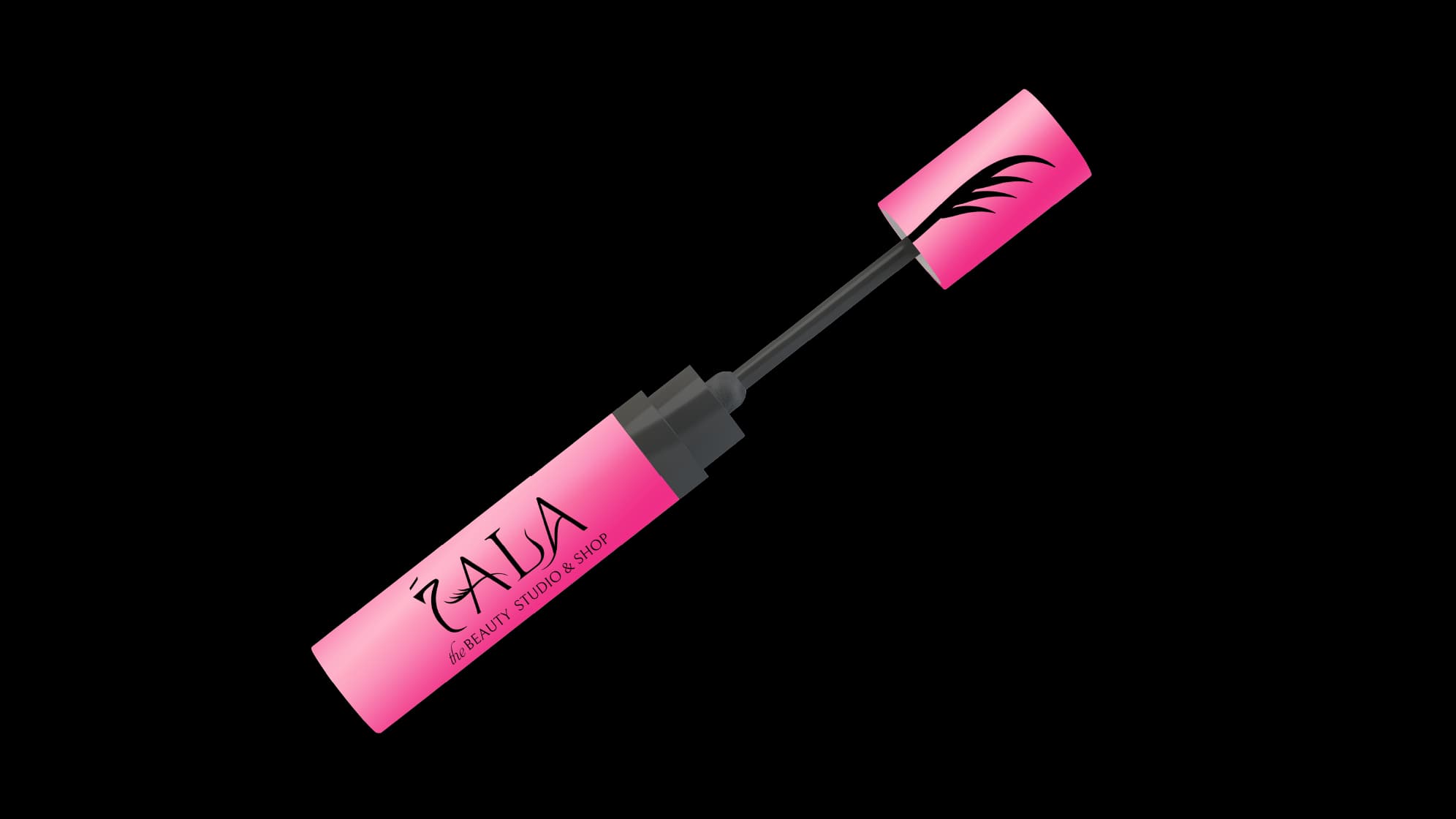
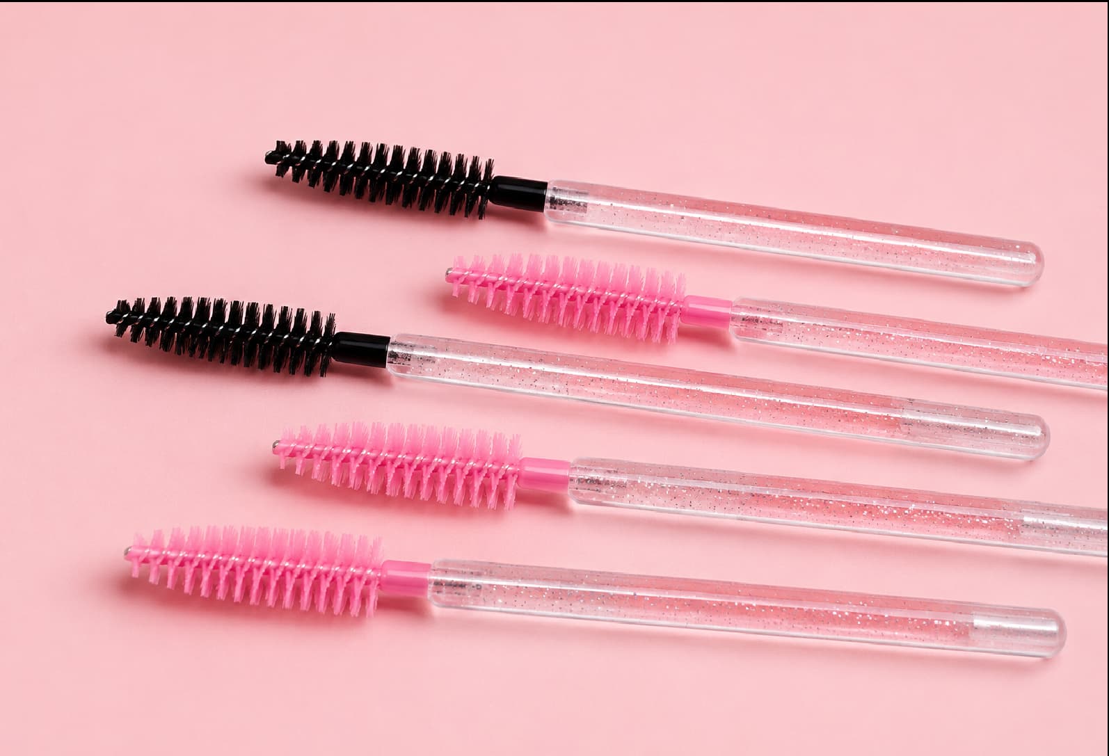
The brand language carries onto product — a lash serum applicator finished in the 7ala pink, with the lash motif marking the wand.
Client
7ALA Beauty Studio
Sector
Beauty & Cosmetics
Scope
Brand Identity • Visual Identity • Social Media Assets
Year
2024


